
App Update: Interactive Map & Grouped Reports
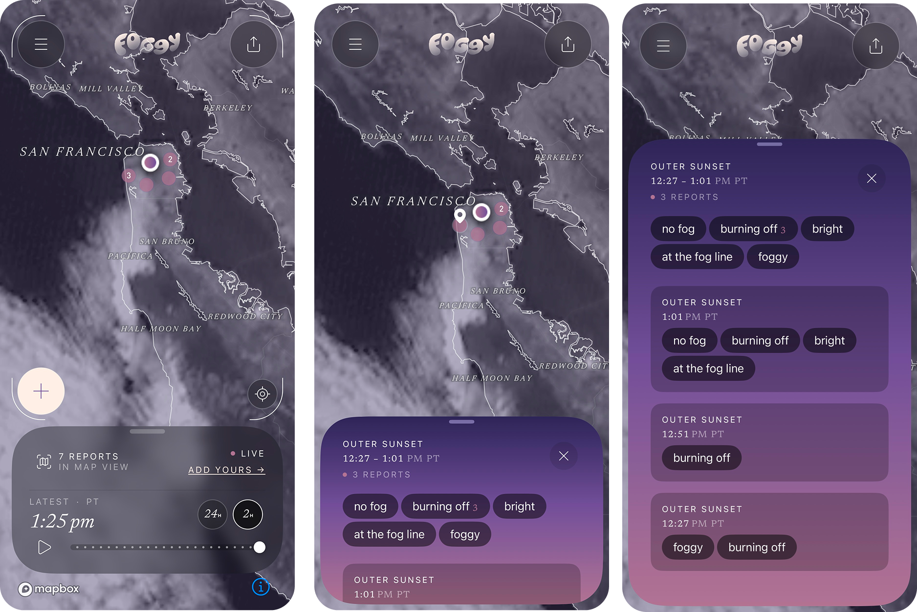
Community reports are now grouped by location and you can tap the dots on the map to see them.
Too much of a good thing
Community reports bring what our community is experiencing out into the open for everyone to see and learn from. They are a unique and special part of Foggy and we love them very much. Except when there are so many of them at the same time that they cover up the map.
In the latest version of Foggy released this week, we are launching grouped reports. Reports that sit close together on the map are now grouped into a single cluster, so a busy spot reads as one moment instead of a stack of separate dots. A number inside the dot tells you how many reports are in the cluster when there is more than one.
Tap, tap, tap…
In addition, every dot and cluster is now tappable (c’mon you know you have tried to tap them before). Tap the dot to see the report or multiple reports represented by the dot.
And reports from the Community Fog Log are tappable too. From the list of reports, tap one and jump straight to where they live on the map
Our intent is that this will make it easier for you to get a feel for an area at a glance, then look closer at individual reports. It turns the map into a way to explore and learn what's happening with the conditions somewhere, built on observations someone took the time to report. Thank you to all you frequent reporters out there!
One more thing
Of note, in this latest release we also removed the Near Me button/functionality since, as we have learned, people mostly want to see places where they are not currently located. We still have the Locate Me button to quickly center the map on your current location.
Updates are available in both iOS App Store and Google Play today!
—The Foggy Team
