
App Update: Improving your report’s location
You can now help us name the neighborhood for your report.
Still anonymous, still never your exact spot. Grab the app update today.
What’s in a name?
Where a neighborhood starts and ends isn't really a map question. It's a cultural one. People carry their own sense of what a place is called, shaped by history, habit, and who they talk to, not just where a line gets drawn.
Fine tuning your report’s location
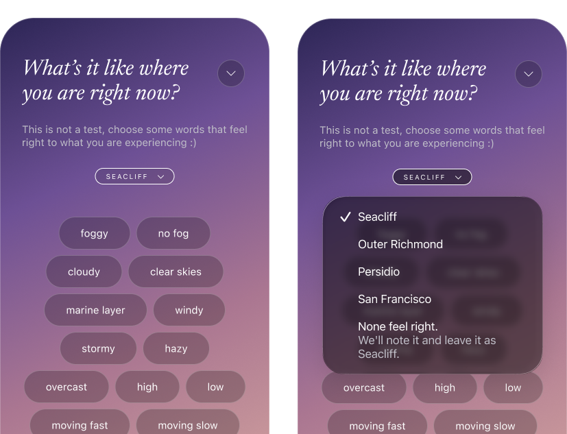
So we built a small thing: when you submit a report, we now show you the default neighborhood we’ll attach your report to. If you feel it’s not accurate, you can pick from a few nearby neighborhood options. We don't assume we know best. This gives you more control over how your report is represented, and helps us learn as we go.
There’s a bit more to how this works
If you feel the options listed don’t do better than the default neighborhood we started with, choose the last option: “none feel right.” In that case, your report will be grouped with that default neighborhood but we’ll get the signal that we don’t have the right options available for you to choose from.
And if you do pick one of the alternatives, the next time you are in the same general vicinity, we’ll remember your selection so you’ll see it as the default location for your report.
Not done yet
If you are feeling like this experience is not quite done yet, we agree with you! We are already planning a set of improvements to location names, how you contribute to naming your reports, and how reports get grouped to give you an even better idea of what conditions are like out there. We’ll get back to building those things as soon as we hit publish on this post.
Some things won’t change
This is about giving your report more context, not more precision on your location. Your reports are still anonymous and still never expose your exact location. That's not changing. We're working on the bigger picture of how Foggy understands location, and this is one small, visible piece of that.
A map view improvement we forgot to tell you about
A few weeks back we added an option to the map view screen. You probably already know you can open the Community Report screen by pulling up on the handle on drawer (the bottom box). Did you see that you can also make the drawer smaller by pushing down on the handle?? We call that the mini-drawer. Mini-drawer mode lets you see more of the map while still giving you access to the fog playback controls. Give it a try!
—The Foggy Team
