
Giving the map more space to breathe
Foggy's map is getting a little taller this week. Here's the thinking behind it.
Point Reyes in the north, Santa Cruz and Monterey Bay in the south… technically, they've always been on Foggy's map. But they sat right at the edge of it. In-bounds enough to see, not enough to really spend time in. A few of you in the Foggy community said as much and asked for more room to actually use Foggy in and around those coastal communities, not just glimpse them.
So we made more space on the map, a bit north and a bit south, allowing you to explore conditions on the entire stretch of coast from Point Reyes to Monterey.
This isn't about making Foggy’s coverage area bigger. It's still the same focused app for tracking Bay Area fog, just with a little more breathing room where people asked for it to make the area we already cover genuinely usable. We are staying centered on San Francisco as a natural anchor… recognizable by the Golden Gate where fog tends to move into the Bay.
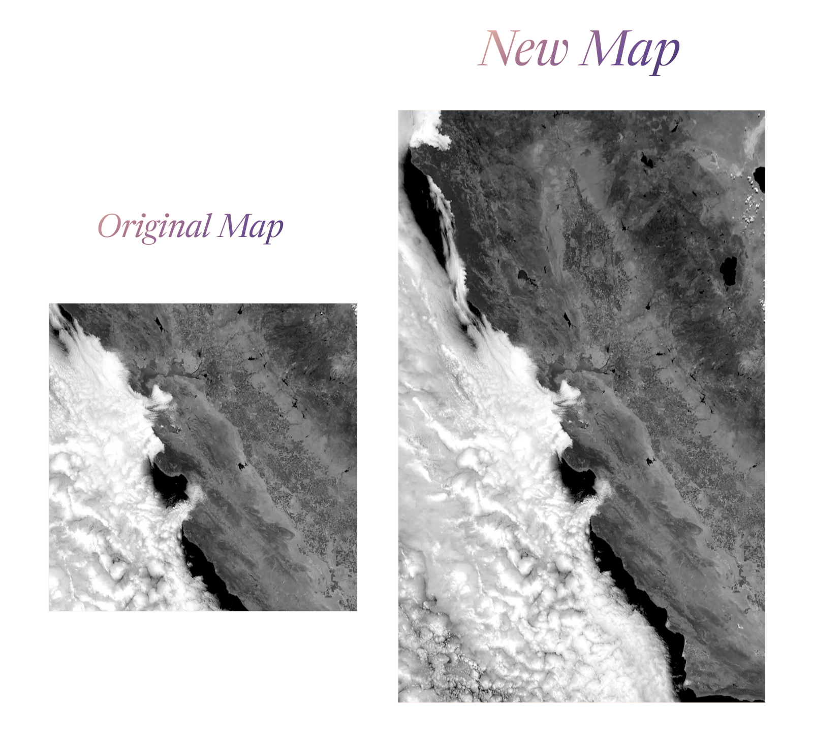
“Cool! How do I get these taller maps?”
If you installed Foggy already, update your app to see them as it rolls out this week. If you haven’t yet, you’ll see the taller maps once you do.
What’s top of mind for the Foggy Team?
In doing this latest work and the work to come, we’re balancing a number of dimensions: coverage area (staying focused on the Bay Area), image quality (showing the fog), utility (where to place the controls for ease of use), and more. We obsess over this stuff and love exploring the possibilities, but ultimately, delivering the experience that is the most useful and joyful to use for you is what matters the most to us. Let us know how it feels.
-The Foggy Team
